
Interview with Alonso Tattoos
Hello Alonso Tattoos! Thank
you so much for taking the time to do this interview. Can you take
us back to the very beginning? Do you remember the specific moment
or piece of art that made you realize tattooing was the path you
wanted to follow? When I did my very first tattoo 11 years ago I
tattooed one of my best friends. I realised the amount of freedom
and beauty that this type of art brings to the client and to the
artist. That made me fall in love instantly with this path and
became obsessed into bringing the best pieces I could make.
Q: You work realism style now, but when you started, what was your
initial creative direction? How long did it take before you felt
your personal 'voice' start to emerge from the machine?
Q: At the beginning I was more drawn into Newschool and illustrative
styles. I started studying great artists such as Victor Chil, Fredao
Oliveira, Timmy B, James Tex and other similar artists. But it was
when I was already 5 years into tattooing that I realised that the
customers were more attracted to black and grey realism, which at
that point I was doing it on a daily basis. That helped me to master
the black and grey technique. So I could say that the clients led me
into this path.
Q: Did you have any influential people who taught you the
fundamentals of drawing or tattooing or you are a self taught
artist?
A: I think every artist and colleague I cross my path with taught me
something, on different levels. But I’ve always been studying by
myself, taking online courses from the artis I admire the most, not
only from the tattoo industry but also from the film industry, video
games. But the main influence was my first mentor who taught me the
most important elements of tattooing such as technique, composition,
color theory and how to make a tattoo that last on the skin for
longer.
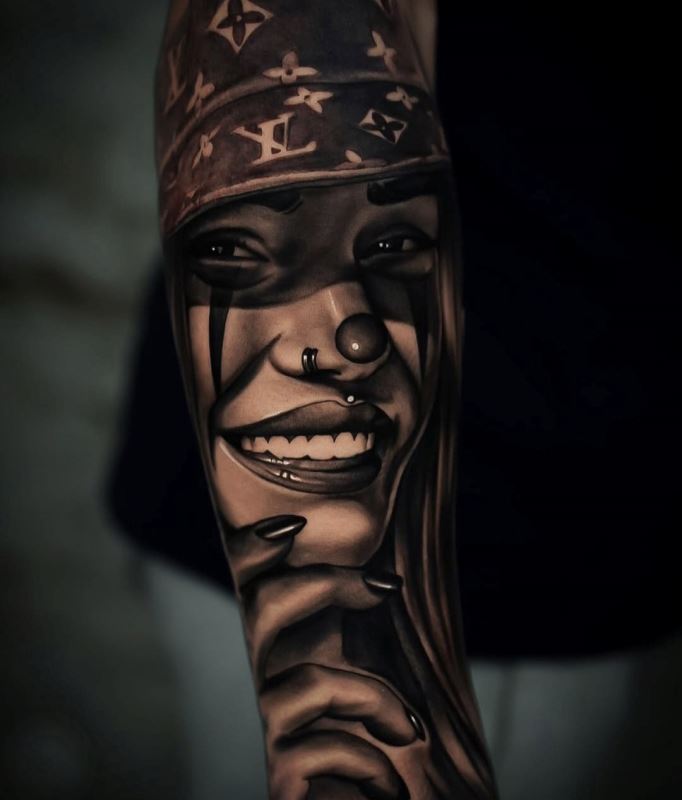
Q: The way you blend different elements in one tattoo is
very seamless. What is your process for designing a layout that
flows naturally with the body's anatomy?
A: To get the best results in my compositions I always try to follow
the natural anatomy of the body of the client and follow the muscles
lines. Also the contrasts in the design needs to be in harmony with
the skin colour and the zone on the body we are working on. For
example a zone that’s more exposed to the sun needs to have more
open skin (skin without ink). Something that helps me to find a
right “flow” to the composition is to imagine some syrup flowing
down the zone, like the arm, and imaging what are the paths that
would take. Normally those are the lines that are going to guide my
composition.
Q: Who decides about the final design?
A: The design is something I work alongside with the client. I ask
for visual references of tattoos or designs the client likes and
what are the things they like the most about it. After that I ask
what’s the meaning behind the tattoo, what it represents for them
and what’s their exposure to the sun in that area (like if they work
under the sun or if she/he does sports). With that information I can
work on a design that can be unique, personalised and I know that
I’m going to enjoy working on.
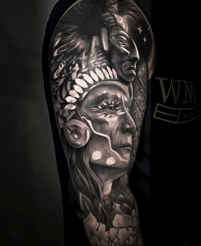
Q: You excel at both color and black and gray technique.
Which one do you prefer?
A: I like both styles, but as everything they have their good and
bad. Colors have more room to express emotions and a more “fine art”
feeling, also is quite fun to do. The downside is that it doesn't
work that well in tan skins as (myself) most of the time. Also it
takes longer to finish a piece. On the other hand black and gray is
more straightforward, you only have to think in volumes and textures
and it suits most of the skin colors and types. The healing process
is less intense and also is a great style if you’re travelling or
doing guest spots. The only downside I would tell is that I’ll lack
the dimension that color gives. For that main reason I would say
that my favourite style nowadays is black and gray.
Q: Why realism? What do you like the most about this style
and would you experiment with other styles?
A: Since I was a child I was always drawn to realism, copying things
from the real world into a piece of paper was something magical and
the way you have to learn to rethink how you see reality was a very
challenging game I enjoyed playing. Later in my life when I acquired
more knowledge I started drawing from imagination which gave me the
freedom to create whatever I wanted. That’s why I used to love
newschool so much (and I still do). But when you start tattooing (at
least in my time) you had to do everything the client wanted. For
that reason I had to experiment with almost all of the other styles
such as watercolour, oriental, fine line, and others. Right now I’m
focused on doing more freehand realism and trying to mix it with
other styles like Illustration and Tribal-like designs.
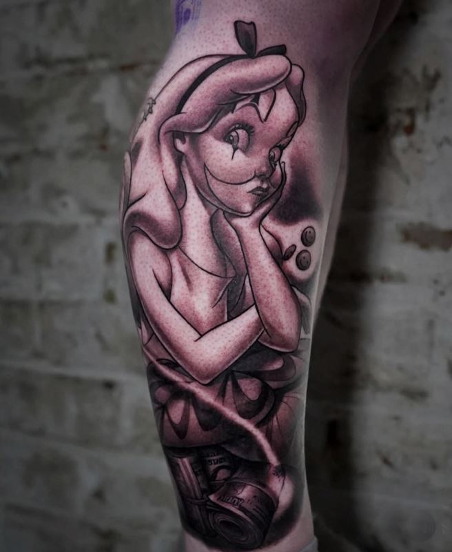
Q: Your work features incredibly smooth gradients,
particularly in the portraits. How do you approach your shading to
achieve that "photo-soft" look versus more textured elements like
the feathers on your eagle pieces?
A: That’s just knowing the technique and working slowly. I try to
make the least amount of damage possible to the skin and build the
tones smoothly. I normally start tracing the heavy blacks first then
I go to the medium tones to separate the light from the shadow.
After that I go with the dark tones to blend them into the grays.
And last I go for the very light ones and white here it needs it. I
like to prepare my grey tones with a couple of drops of white, that
helps a lot with the smoothness. You can also buy some “white wash
sets” which most of the time works just fine.
Q: Micro-realism and soft shading can sometimes fade
differently over time. How do you balance the need for "softness" in
realism with the "boldness" needed to make a tattoo last for 10+
years?
A: Every composition needs a certain amount of black to stand out
and to keep a tattoo solid over time. With the shading I always
recommend to separate the tones and saturate the skin with that tone
without overworking the skin. In realism as long as you have a clear
definition between shadow and light your tattoo is going to age
better. Also helps to make it one scale darker in the value scale,
so if it fades a little it is going to get to the real tone that
it's going to get for the rest of its life. That may scare some of
the clients but it’s important to communicate this beforehand to
avoid any misunderstanding. With the micro realism itself is quite
hard for it to age well. All skins are different, the ink always
moves around over the years, so if you’re doing a small face you
have to keep in mind that the eyes, nose and every little dettails
that are too close together will merge and form one shape. It does
help a little to put some heavy white or grays around to keep the
black shapes separate, but in my opinion I wouldn’t recommend to get
a micro realism. Go big or go home!
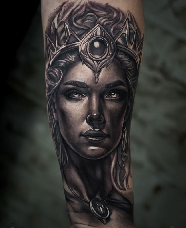
Q: Several of your pieces have very dramatic, cinematic
lighting. When you are designing a custom piece, how much do you
prioritize the "light source" to ensure the tattoo looks 3D on the
skin?
A: That’s a very important element for my work. As I said before,
that's an excellent way to make a tattoo last longer. Also, dramatic
contrast makes images stand out more. Now to make that design look
more 3D it’s necessary to be on the perfect placement on the skin. I
like to work with elements in a 3/4 view within the perfect position
that gives the design that feel. That’s why a tattoo needs to be big
and hopefully wrap around the area you’re tattooing.
Q: What makes a good portrait tattoo?
A: The reference needs to be clear, have a decent resolution and
good contrast. The rest is having good technique and being patient.
Q: When you are painting on canvas, you use different
brushes for different textures. When tattooing, how do you translate
"brushstrokes" into needle movements to get that soft, feathered
look?
A: I think everything depends on what you want to achieve. The
natural "brush stroke" of the tattoo machine is the stipple and the
whip pattern. you can use that at your will to create some kind of
texture. The other thing is to mimic texture, for example if the
design you're tattooing has some brush strokes, you can mimic that
into skin. That's the same for the soft feathery textures.
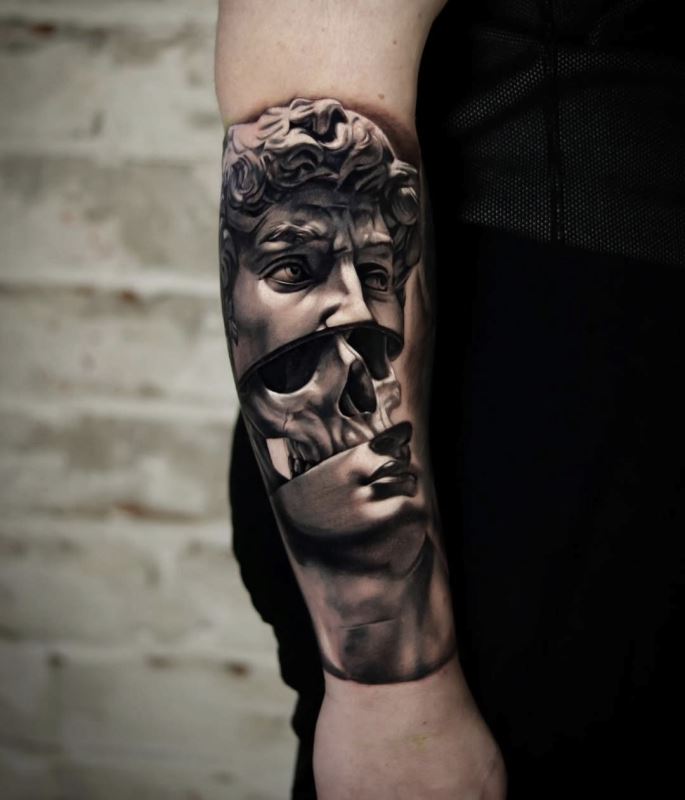
Q: How much does your experience mixing physical paint on a
palette help you understand how to "blend" ink colors directly in
the skin?
A: A lot! It's super necessary to learn color theory and to practice
it as much as you can. Mixing real pigments like oils helps you to
understand how colors interact with each other and to learn how
important color temperature is. The more you practice with oils and
pigments you are going to achieve better results in your work with
more polish and a more mature and sophisticated color palette.
Q: Many realism artists study the "Old Masters" (like Da
Vinci or Caravaggio) to understand Chiaroscuro (the dramatic use of
light and dark). Did you have formal training in classical drawing
or painting, and how does that "eye" for light help you when a
reference photo isn't perfect?
A: I did go to college for a year where I fell in love with the old
masters and it was at that point when I realised that art it's been
here for a very long time and everything I was trying to discover
and make sense, someone already thought and spend a life mastering.
Take the time to learn from the greatest artist from life, it's
going to make your life easier. Some of these old masters are still
my favourite artists, such as John Singer Sargent, Caravaggio, J.C
Leyendecker, Rembrandt, Caravaggio, and the list goes on and on.
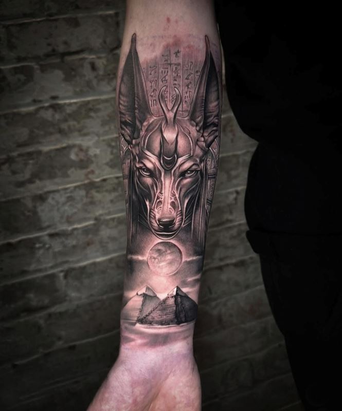
Q: Portraits of loved ones or pets (like your German
Shepherd piece) are deeply emotional. How do you handle the pressure
of capturing the "soul" of a subject while maintaining your specific
artistic style?
A: You always have to keep in mind that unless you know the person
or the animal you're not going to portray it in the exact way. Same
as a photograph is not going to capture the full personality of that
loved one. That's why when you copy from a photograph you already
lose something, and then on the skin it loses something else. That's
why as an artist my goal is to gather as much information about the
subject by talking with the customer on a deeper level, maybe with a
coffee and deeply listening to their stories together. Thanks to
that I can get a more precise mental image of that loved one and
what it means to the client, to get as close as possible to portray
it in a real way. Doing this work can be hard, some of the Stories
can be beautiful and inspiring and others can be heartbreaking and
really sad. Because of this kind of trust they give me (by opening
their hearts to me) I've ended up becoming friends with many people
that started as clients and nowadays we speak on a daily basis. It's
a beautiful work, but you need to be prepare and zen like to not
absorb that energy for the rest of the week.
Q: Please write down your studio location and website/social
media links. Also let us know if you are available for bookings.
A: I have my private studio in my hometown, Santiago, Chile, just
next to the National Fine Arts Museum. But I spend most of the time
of the year travelling around the globe doing guest spots. My next
destinations will be Canada, Mexico and Europe. My social media is
Instagram: @Tattoosbyalonso_ For bookings you can message me at the
same instagram or an email to bookings.tattoosbyalonso@gmail.com
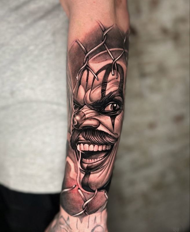
Q: Do you like the local tattoo scene? Do you see progress?
A: I love the tattoo scene,everyone is putting so much effort to get
better and to live out of this beautiful craft. As in everything
there's always some bad apples, but thanks to social media they
don't last for too long in this industry. All the new styles that
are coming out inspire me to keep improving and to acquire more
tools to accomplish the expectations of the clients.
Q: What about the global tattoo scene? Do you think we as a
collective are heading in the right direction?
A: I think we are going in the right direction as long as the
artists are being honest with themselves and the community, that
always leads to a good outcome. I love the experimentation that's
going on and the visibility the social media gives to everyone. Also
I love the brotherhood that the tattooing gives you around the
world. Wherever I go when I meet other artists just by being part of
this beautiful community I already have some friends and people
trying to help me. I'm sure it is the same for most nomad artists.
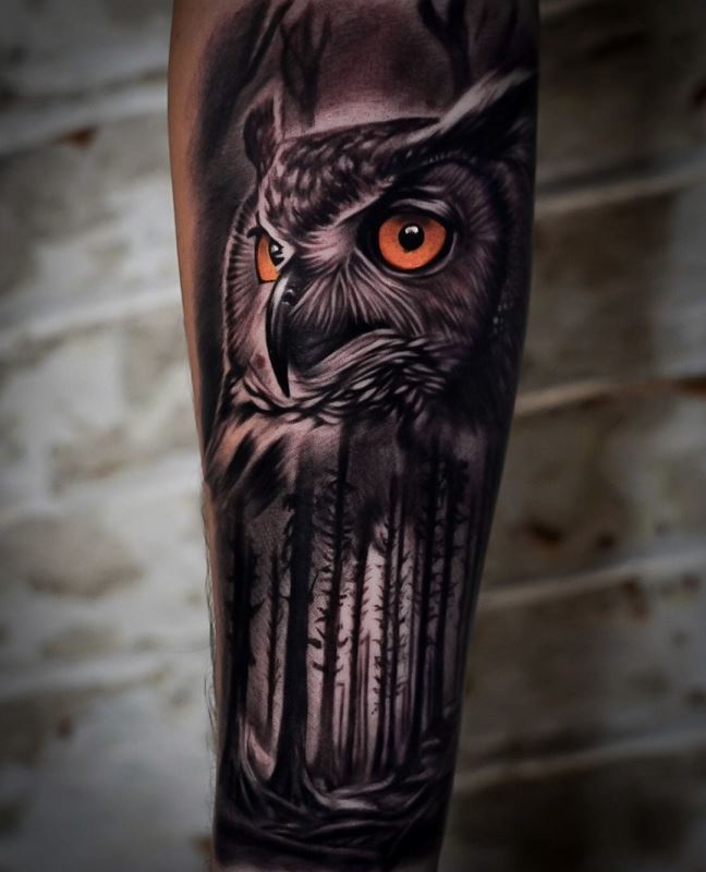
Q: The use of AI in tattoo design (for references and
background textures) is a hot topic right now. Do you see AI as a
tool that helps the realism genre evolve, or does it risk making the
style look too "digital" and less "human"?
A: I think that AI is a very useful tool. It's amazing the way it's
evolving and it's great to get the exact reference you have in your
mind appear in front of you but it's still extremely important to
keep drawing and learning about the art fundamentals to fix and
change the image at your will. I understand why so many artists have
negative thoughts and feel their career is threatened by this
technology but it is here already and so far has made my life way
easier than ten years ago. The human likeness can be given by the
artist himself if he knows the art fundamentals and has the mileage.
Q: The technology for needles and ink has advanced rapidly
in the last few years. Is there a specific piece of equipment or a
new ink palette that has recently changed the way you approach your
color work?
A: Lately I've been exploring different brands of colors and all of
them have some really good colors and some others that I can't get
them to work properly, that's why I get the ones that work for me.
But some brands are very consistent with their quality and the
pigments. Those brands are RAW colors, World Famous and Solid Ink
(I'm not sponsored by any of these brands). I'm sure there are some
other good brands but I haven't had the opportunity to try. And with
the needles or cartridges they may have reached the optimum level.
As long as they have a good quality metal and a clean sharpness, you
are ready to do the best work that you can. Some brands that I use
are Kwadron, Cheyenne, Metrix and Emalla or Mast (not sponsored by
any brand).
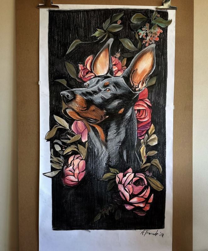
Q: Looking back at your early work compared to your current
portfolio, what is the one technical skill you feel you’ve
"unlocked" that changed everything for you?
A: It's hard to say just one skill because everything is evolving at
the same pace but I would say that is the cleaness and the soft
shading. That gave me the finesse I was looking for so long.
Q: Realism requires intense, microscopic focus. When you
feel burnt out, where do you go to recharge your creative
"batteries"? Is it a specific museum, a type of music, or a
different medium of art altogether?
A: That's been a huge challenge for me, at the beginning I used to
struggle with the burn out until I started going to the gym and
spending more time with friends at music festivals. Also always
going to new exhibitions at the museum and local art galleries.
Q: Beyond the art itself, what is the most rewarding thing
about the relationships you’ve built with your long-term clients and
fellow artists over the years?
A: I really appreciate the trust they give me everyday by telling me
about their life either good or bad and the trust of letting me mark
their skin for the rest of their lives. That's something I'm very
grateful, also the trust they have in me and my abilities.
Q: For the young artists, what is the most important
"fundamental" they should practice before they ever pick up a tattoo
machine?
A: I would say that being humble, consistency, being patient, love
what you and always and trust the process. Those are more than one,
but if I have to choose one, it would be to love what you do. That
is going to be the main engine to help you grow as an artist and as
a person.
Interview: Ivana Kancheska
Publishing Date: January 13 2026


