
Interview with Cristian Perilla
Today, we are talking with Cristian Perilla,
a Colombian-born artist who has truly taken his craft to the global
stage. Known for his breathtaking mastery of Color Realism and
high-contrast portraits, Cristian has built a reputation for turning
skin into a cinematic canvas. With 18 awards to his name and a
portfolio that ranges from hyper-realistic icons to vibrant
pop-culture legends, he’s not just a tattooer, he’s a storyteller in
ink. We’re going to dive into his journey from his early days in
Colombia to his vision for the future of the industry.
Q: Cristian, looking at your portfolio, your work feels more
like 'fine art' than traditional tattooing. When you first picked up
a machine, was this hyper-realistic, cinematic style always the
goal, or did you start somewhere completely different?
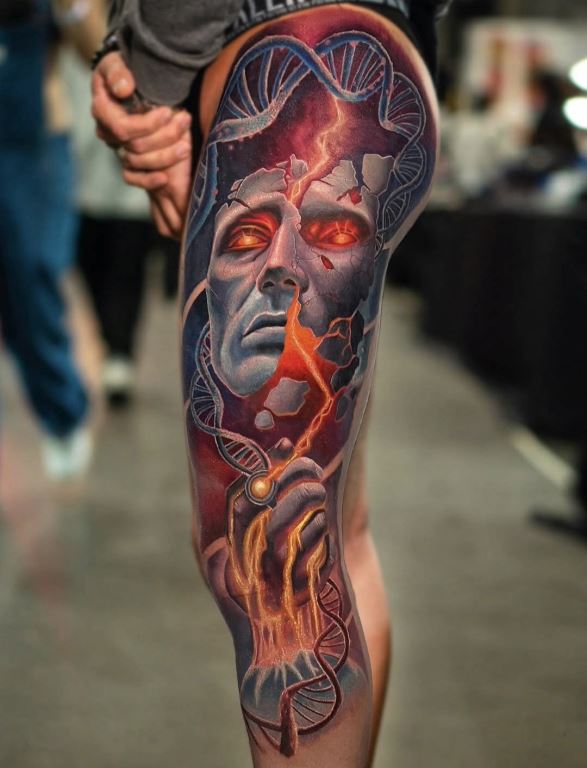
A: It’s an interesting question because it takes me straight back to
my beginnings. When I had only been tattooing for a couple of weeks,
I already took the risk of doing a tattoo very similar to what I do
today: a large, ambitious piece with a realistic intention. From
there, I explored many different styles, which is part of the
learning process, but over time I realized that I somehow came back
to the origin. Today, I’m developing the same visual language as
that first big tattoo I dared to do, which, for a beginner,
surprisingly didn’t turn out bad.
Q: Your bio says “From Colombia to the
World.” In your experience traveling and winning awards across
different countries, is there a specific city or culture that pushed
your art to the next level?
A: I spent about seven months in Turkey, where I connected deeply
with the people and the culture and learned a lot on a personal
level. However, it was in Europe, especially in Germany and the
Netherlands where I truly felt challenged to push myself and prove
my talent at a high level. That said, without being pretentious, I
don’t know another country like Colombia. The amount of inspiration
and the number of influential artists there is incredible, and my
roots continue to be one of my strongest creative sources.
Q: What was the most difficult “old school” rule or
technique you had to master during your early years that still helps
you today?
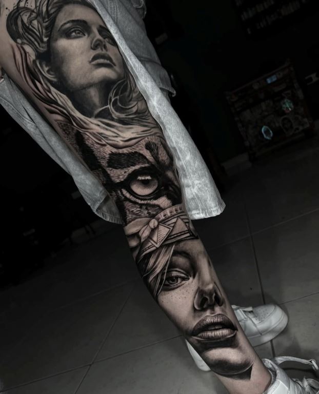
A: Fine line work is often underestimated, but it has the smallest
margin for error. Mastering it forced me to refine every aspect of
my technique, hand control, precision, focus, and respect for the
skin. That discipline still directly influences the quality of my
work today.
Q: Many of your pieces, particularly the
sci-fi and portrait work, feature an incredible internal “light” or
glow. What’s the secret to making ink look like it’s actually
illuminated on the skin?
A: The secret is contrast. Light doesn’t exist without shadow. I
build deep, solid shadows so the highlights truly stand out. It’s
not just about using white or bright colors, but about creating a
full value range that tricks the eye and gives the tattoo real depth
and luminosity.
Q: From Snoop Dogg to The Walking Dead and Dragon Ball Z,
you tattoo many iconic characters. How do you add your personal
“Cristian Perilla” stamp to characters people already know so well?
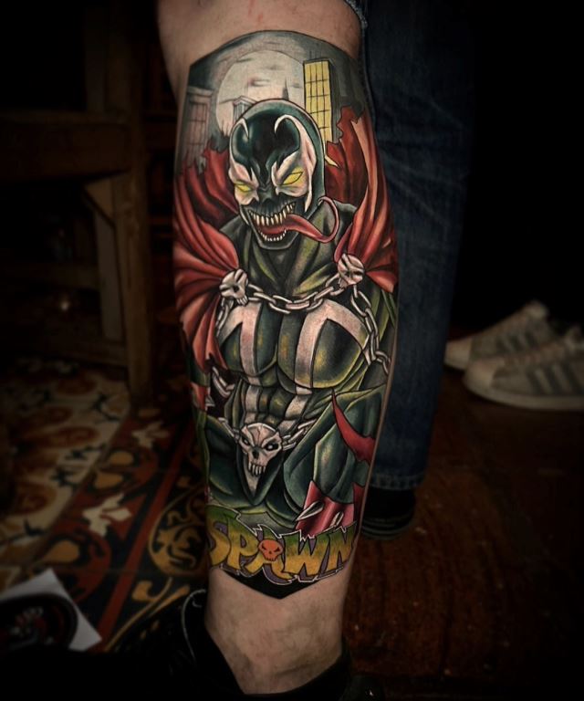
A: When the tattoo isn’t strict photo-realism and the client gives
me some creative freedom, that’s where my personal stamp really
appears. I respect the essence of the character, but I reinterpret
it through a more artistic and cinematic approach, using lighting,
contrast, and composition so the piece feels unique rather than just
recognizable.
Q: In your realism pieces, your shadows are incredibly deep.
Many artists are afraid of using too much black, but you embrace it.
How does that heavy contrast help your colors pop and keep the
tattoo from looking flat?
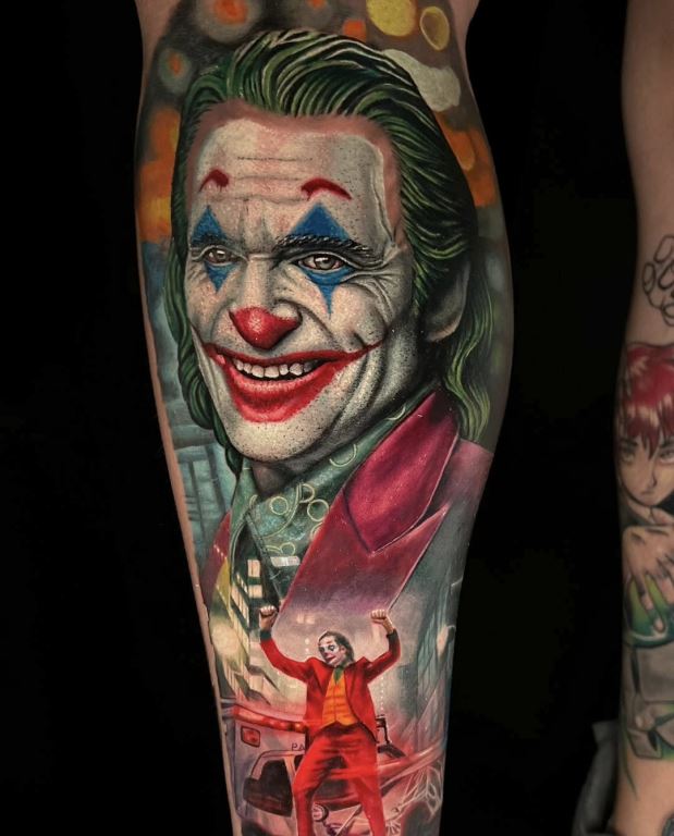
A: Fear of black is what causes many tattoos to age poorly. Deep
shadows create structure and support the color over time. I prefer
tattoos with strength, character, and clear readability, even years
later. Contrast is what keeps a piece alive.
Q: You work with highly saturated
pigments. How do you adapt your color palette to different skin
undertones while maintaining that “neon” brilliance?
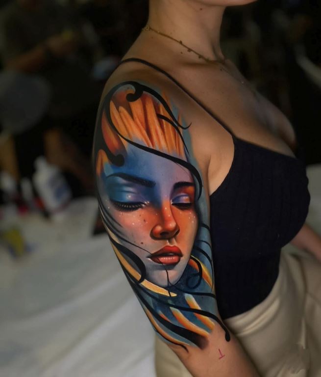
A: Every skin tone is different and deserves respect. I adapt my
palette based on the skin’s undertone while maintaining strong
contrast. Not every color works the same on every skin, so I
carefully select pigments to achieve impact without forcing the skin
or compromising longevity.
Q: You have a unique way of mixing realism with graphic
elements. How do you balance those elements so they don’t distract
from the realistic portrait?
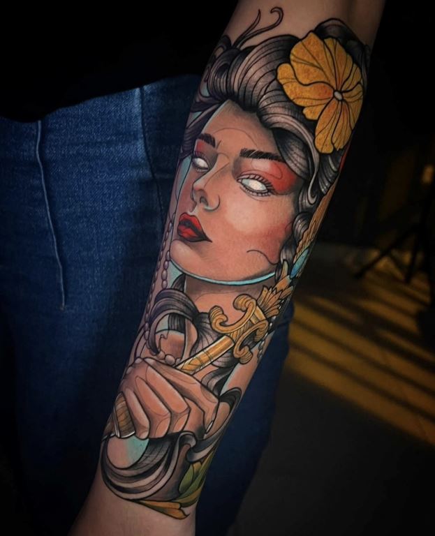
A: Graphic elements are always there to serve the portrait, not the
other way around. I use them to guide the viewer’s eye, reinforce
the composition, or add context. The face is always the main
character, everything else supports it.
Q: Your portfolio shows many different textures - metal
armor, wet skin, animal fur, even liquid in a bottle. What’s the
most challenging texture for you to replicate on skin, and what’s
your trick for making it feel tangible?
A: Polished metal, wet skin, and hair textures are among the most
challenging. Each requires a very precise understanding of how light
behaves. The key is observation and simplification, placing the
right details in the right spots so the eye completes the texture
naturally.
Q: A leg or an arm isn’t a flat piece of
paper. When designing a large-scale piece like your award-winning
leg sleeves, how much is pre-planned digitally versus freehanded to
fit the client’s muscle structure?
A: The base design is planned digitally, but the final adaptation
always happens on the body. Muscle flow, movement, and anatomy are
essential. A great tattoo should flow with the body, not fight
against it.
Q: Your tattoos often look like they’re sitting on top of
the skin or even coming out of it. What’s the most satisfying part
of the process when an image stops looking flat and starts feeling
three-dimensional?
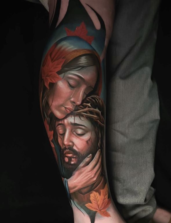
A: It’s when the lights and shadows begin to lock into place and the
image gains depth. That’s when the tattoo starts to feel alive.
White is our ace up the sleeve, used carefully, it’s what truly
brings the piece to life.
Q: In realism, there’s nowhere to hide. How do you stay calm
and focused knowing every millimeter has to be perfect?
A: Calm comes from preparation. For me, having a very detailed,
hand-made stencil is essential. It allows me to work confidently,
stay focused, and maintain control throughout the entire process.
Q: Unlike a painting in a gallery, your
art travels, ages, and lives with the client. How does it feel
knowing your canvas is a living, breathing person?
A: It’s a huge responsibility and an honor. My work becomes part of
someone’s life forever. That pushes me to give my best, not only
technically but also on a human level.
Q: If you compare your realism work from five years ago to
now, what’s the biggest evolution you see?
A: I’ve learned to simplify. Before, I wanted to constantly prove my
technique, now I focus on balance, readability, and longevity.
Following the healing process is also key, it’s where you truly
understand which decisions deliver the best long-term results.
Q: You have a highlight dedicated to your awards. Which
specific win felt like the turning point for your career, and why?
A: Kassel, Germany, was my first major international achievement and
marked a turning point in my career. That said, awards won in
Colombia carry an even higher level of difficulty. The competition
there is extremely strong, so winning at home is truly challenging
and very meaningful to me.
Q: You are sponsored by several major
brands. How has having the support of industry leaders changed the
way you work?
A: It allows me to work with top-quality materials and focus
entirely on creating. It also provides visibility and strong support
within the industry, which is invaluable.
Q: One of your highlights is “Proyecto Tattoo 2026.” Can you
share the vision behind this project and where you hope to take your
art in the next few years?
A: Proyecto Tattoo 2026 is a two-year vision focused on creating
large-scale pieces with highly committed clients. The goal is to
push my artistic, technical, and conceptual limits and deliver my
best work.
Q: Your work is incredibly complex. How do you handle
clients who might feel nervous or try to micromanage the design?
A: Honestly, I don’t usually keep pre-made designs saved on my iPad.
I prefer to talk with the clients, listen to their story, their
tastes, and their interests, and design from there. That process
creates a strong bond and builds trust, which naturally prevents
over-control of the design.
Q: Tattoo chairs are famous for deep conversations. Do you
find you learn a lot about your clients’ lives during sessions, or
do you prefer working in a silent, focused “zone”?
A: It depends on the client. Sometimes deep conversations happen
naturally, other times silence helps me enter a focused state. Both
moments are valuable.
Q: In an industry where you never stop
learning, do you appreciate the technical challenge of the job more,
or the creative freedom you have now compared to when you started?
A: Both matter, but if I had to choose, I think most of us would
choose creative freedom. That freedom is what truly allows growth
and evolution.
Q: Please write down your studio location and website/social
media links. Also let us know if you are available for bookings.
A: Ink Lovers Studio Cartagena is where I work most of the time.
However, I travel frequently and spend almost half of the year
working in other cities and countries.
Instagram: @cristianperilla
Q: If you could go back to the very beginning and tell young
Cristian Perilla one thing worth looking forward to in this career,
what would it be?
A: I would tell him that he will go far and to never forget where he
comes from. Trust the process, your identity, and your roots, they
are a fundamental part of what makes your work authentic.


