
Interview with Jordan Ferris
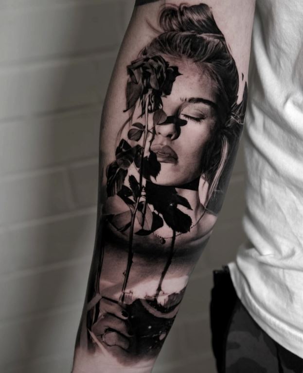
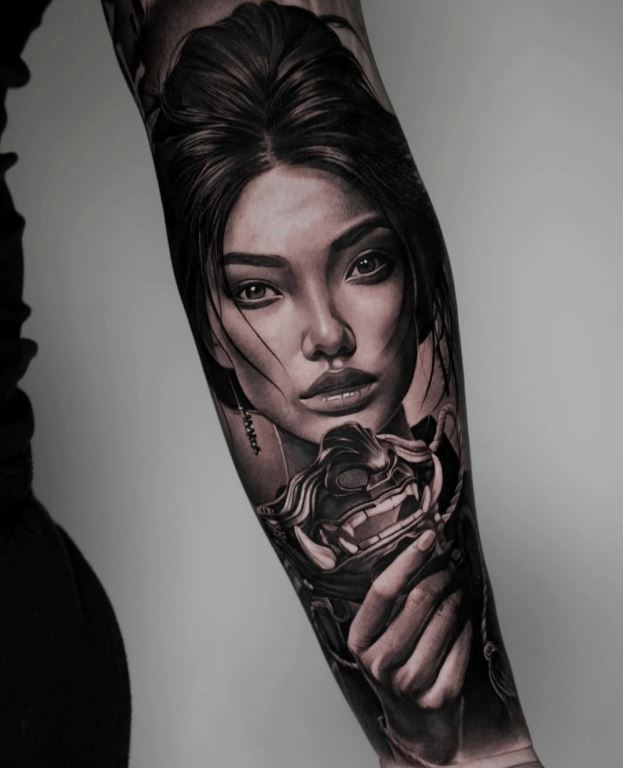
Jordan, your portfolio feels like a bridge between the Uffizi Gallery and the streets of Bristol. From hyper-realistic portraits of icons like Ozzy and Jim Morrison to massive, neoclassical back pieces, your work carries a distinct 'cinematic' weight. We’d love to dive into the technical and creative journey behind your evolution as an artist. Bristol has a legendary underground art scene. How did growing up in or working around that environment influence your early interest in tattooing? I did Art at school and I always knew this was something I loved to do. I remember spending days drawing and copying album art to pass the time when I was grounded as a teenager. I was into skating and used to hang out at Dean Lane Skatepark, where I tried my hand at some - mostly unimpressive - graffiti (which may not have helped the grounding); I also got the chance to paint a couple of murals at friends’ houses. This area of Bristol was – and still is - particularly well known for its street art culture. It was around that time that I became an apprentice at a studio in North Street, which was owned by my godfather. Being immersed in a creative environment both within and outside the studiocertainly influenced my choice to pursue tattooing further.
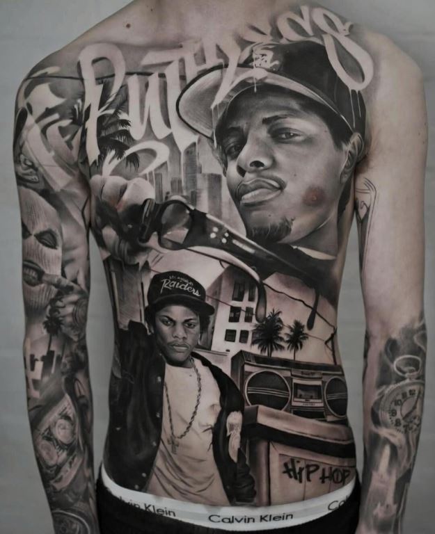
Q: Can you remember the specific moment or
piece of art that made you realize you didn't just want to tattoo,
but specifically wanted to pursue high-level realism?
A: I don’t think there was a specific moment or piece of art that
drew me towards high-level realism. In fact, I remember being
interested in portraits since I was young. As my end of year project
for my Art GCSE, I presented two portraits: a painting of Jimmy
Hendrix and a pencil drawing of Mike Tyson. I already knew then that
I was mostly interested in observing details and replicating
realistic images. The beginning of my tattooing journey included a
range of styles, including Japanese tattoos, which allowed me to
learn the basics of linework, colour, shading and composition. These
skills were necessary stepping stones towards what I knew was my
goal: to be able to create high-level realistic tattoos. As I
developed, I was then able to move towards this goal and eventually
decided to pursue black and grey realism exclusively.
Q: Looking back at your apprentice days/the early days, what
was the hardest technical skill for you to wrap your head around?
A: Once I was confident with linework and colour, I remember
struggling to wrap my head around using round shaders. However,
light tones were definitely my kryptonite. I found it difficult to
saturate these light tones without making them darker; blending
light tones to skin tones smoothly was also quite technically
challenging for me. Since these are crucial skills for the style I
wanted to focus on, I had no choice but to improve through constant
practice. I was lucky enough to have regular opportunities, at my
first studio and I always tried different techniques and reflected
on the results to adjust my application as needed.
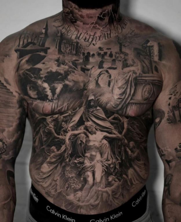
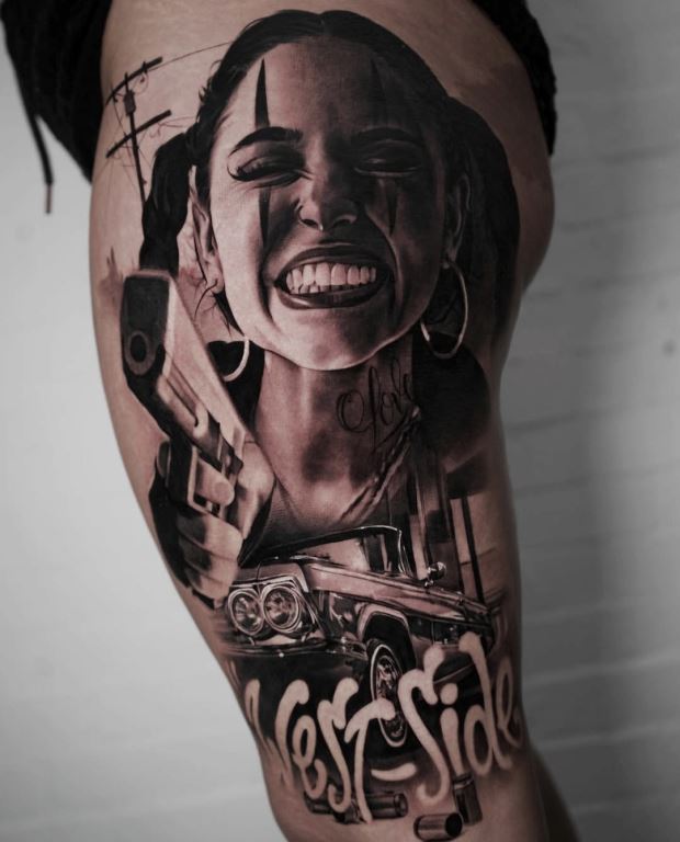
Q: You often transition between tattooing
Greek/Roman sculptures and modern street scenes (like the 'Lowrider'
leg sleeve). How do you adjust your shading technique when moving
between the smooth marble textures of a statue and the gritty
details of a cityscape?
A: I wouldn’t necessarily say that I adjust my technique depending
on the subject matter. Instead, I focus on finding the right images,
closely observing and tattooing the reference as faithfully as I
can. I believe that, if done correctly, the designing process can do
a lot of the work for you, which allows you to maintain a consistent
technique and focus on the details, whatever those may be.
Q: Your bio mentions 'The Pursuit of Mastery.' In a medium
as permanent as tattooing, how do you define 'mastery,' and do you
feel you’ve reached a point where the skin no longer presents
surprises to you?
A: For me, mastery is something that can never be achieved. It is
more about the pursuit itself than it is about the end goal of
becoming a Master. Still today, I am focused on getting to the next
level; I constantly try different machines, inks, needles and
techniques and reflect on my application to make sure I am
challenging myself. While I have become more confident with
experience, everyone’s skin is unique and can react differently
depending on texture, placement, or other external factors. At this
point in my career, I sometimes find myself making instinctive
decisions when choosing needles or machines depending on the project
I am working on. However, I am constantly reviewing my technique as
I go to adapt to different situations and achieve consistent
results.
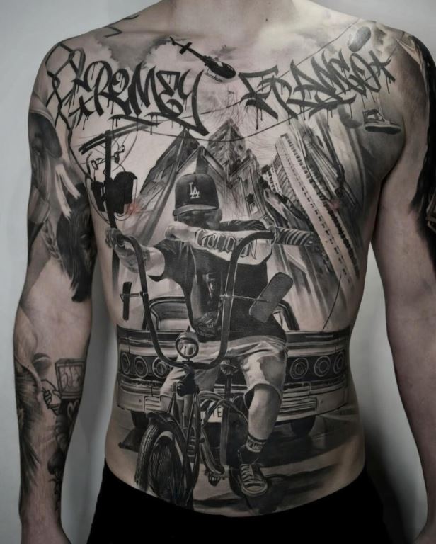
Q: Your work features very deep blacks and
bright skin-tone highlights. How do you approach your 'healed'
results to ensure that these high-contrast pieces don’t lose their
depth over a decade?
A: The one factor that will ensure a tattoo maintains depth and
contrast over time is the use of a range of value ratios. For a
consistent and clear healed result, tattoos need to have the right
balance between dark, medium and light tones. I always consider how
my clients’ own skin tone may affect those value ratios and keep
this in mind when looking for and adjusting reference images for a
specific project. By balancing negative space (skin tone) with the
darker values in the piece, I ensure that the lightest values are
not lost in my healed work while keeping enough contrast and depth
in the long run.
Q: Your work has a very 'Noir' or cinematic quality - heavy
shadows paired with sharp, directional light. When you’re looking
for reference photos, are you looking for the person/object itself,
or are you looking for the way light hits them to create drama?
A: I would say I look for a bit of both. Of course, I am looking for
a specific subject, but I am mainly focused on how the light hits
the object or person and tend to prioritise images with dramatic
lighting. I prefer to use references where a stronger light source
creates harsher shadows and brighter highlights; going back to
having a range of value ratios, I tend to avoid those references who
may appear flat. However, I always adjust the images myself, to
create that right balance of light and shadows which defines my
work.
Q: I have to ask about the Tony Hawk back
piece, it’s an absolute powerhouse of a composition. Could you walk
us through the genesis of that project? Was the concept a
collaborative vision with the client, or did they give you the
creative freedom to architect that narrative from scratch?
A: This piece was a collaboration, mostly led by my client’s
existing references. While I enjoy having creative freedom and
finding my own reference images, I find that some customers can
bring a lot of value to a project by maybe suggesting an idea or
providing some context that leads to a better composition, which was
the case with this one and some of my other projects.
Q: This back piece is incredibly dense with detail, from the
texture of the skate ramp to the intricate engine components at the
bottom. How do you approach the 'focal points' in a piece this large
to ensure the viewer's eye knows exactly where to go first?
A: These decisions can sometimes be based on where an image may look
good in relation to a body part or to other references. However, I
believe it is the link between the images that helps the composition
make sense and creates a narrative that brings it all together. In
this case, I combined the car with the Santa Pod banner and placed
the crowd next to the musician to creates a clearer story and add
context to each individual component. To draw attention to the main
elements, I like to create a balance between contrast, detail and
composition, combining more detailed with simpler elements. For
example, here I blurred the crowd in the background to guide the
viewer’s eye towards the main focal points.
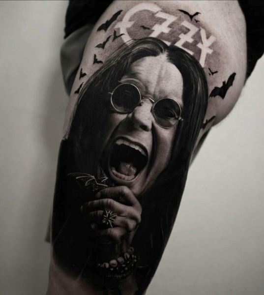
Q: You have a knack for capturing raw
expressions, like the the intense gaze of Johnny Cash. What draws
you to these 'high-emotion' references over standard, polished
portraits? Is there a specific type of human 'character' you find
most satisfying to tattoo?
A: Mainly, I like my work to generate emotion. Usually, a face with
a stronger expression is more interesting and thought provoking than
an expressionless one. I really like the idea of using reference
images which may not be as common, or those which depict the
personality of the person I am representing. I enjoy tattooing
recognisable characters, as having some knowledge about the context
allows me to be more creative and playful with the design and
composition. However, if I had to pick a favourite type of human
character, I would definitely choose female portraits; I find women
to be the most varied in terms of facial expressions, as well as the
most captivating and interesting subjects to represent.
Q: You mentioned that a full chest/stomach piece was
completed in just four sessions of seven hours. For such high-detail
realism, that is an incredible pace. Does this speed help you stay
'in the zone' with the story of the piece, or is it purely a result
of your 'Pursuit of Mastery' in technical efficiency?
A: I believe that my pace is a result of years of developing
efficient tattooing techniques that work for me and my clients.
However, despite working efficiently (going back to pursuing
mastery) there are many external variables that can impact the
tattooing process. The client’s skin, their tolerance, or the
reference images themselves can influence the pace and speed of a
tattoo. Ideally, when working on a large-scale project, I prefer to
see my clients around once a month. This allows enough time for
healing between sessions and helps me maintain focus and interest in
the project, which generally makes it more exciting of a process for
me than completing it over a long period of time.
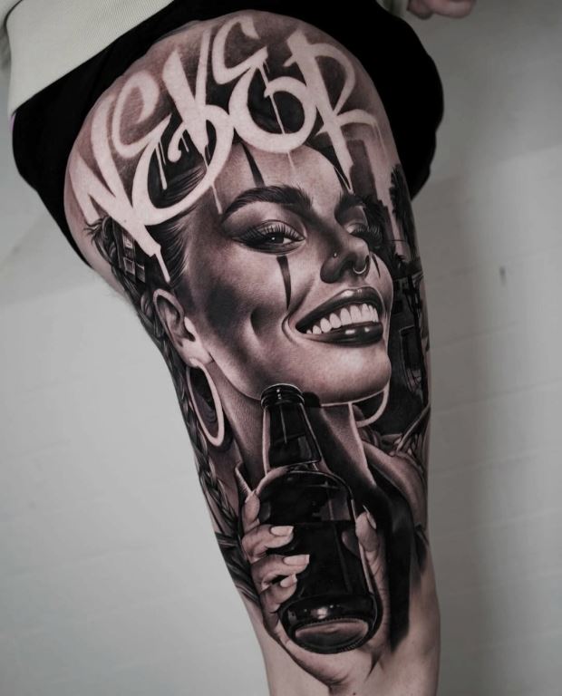
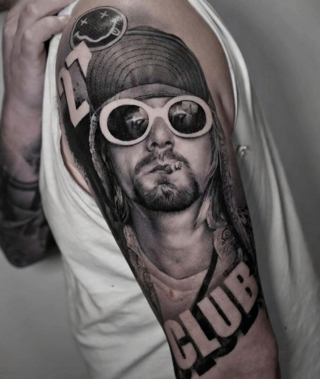
Q: From Mrs. Doubtfire and Wallace &
Gromit to legends like Kurt Cobain and Amy Winehouse, your portfolio
is a deep dive into pop-culture icons. How much of your
'storytelling' vibe is fueled by your own nostalgia for these
figures, and how much is driven by the client's personal connection
to them?
A: Whether I drive the initial idea or the customer does varies by
project. When I am the one leading the concept, I prefer choosing
characters I am familiar with, as understanding their context helps
me create more interesting and playful compositions. For this
reason, if I am ever working on a customer-led project and I do not
know enough about the subject, I always take the time to study them.
For example, I recently worked on a Fight Club piece and dedicated
the evening to watch the movie so I could better understand the
characters. By doing this, I was then able to be more creative with
my composition and enjoyed the tattooing process much more, which I
find, always leads to a better result overall.
Q: Every skin type absorbs ink differently. When you are
aiming for that ultra-smooth, photographic finish, like in the faces
of your portraits, how much does the client's skin texture dictate
your needle choice or your hand speed?
A: My hand speed stays pretty much the same regardless of the skin
texture. With experience, I have been able to identify certain
patterns between technique and application for a range of body
parts, skin textures, or designs. This means I can now make
instinctive decisions when I am preparing for a session, such as
choosing a specific needle gauge or a machine stroke depending on
what part of the body I am tattooing. However, it is important to
always reflect throughout the process and make any necessary
adjustments. For example, depending on how the skin reacts or how
the ink saturates the skin, I may then change my needle gauge during
a tattooing, to increase saturation and minimise skin irritation in
a specific part of the body.
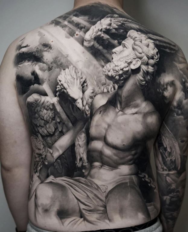
Q: One of the hardest parts of realism is
placing a 2D photograph on a 3D body part without warping the face
or the perspective. Do you have a specific trick for 'wrapping' your
stencils so that the portrait looks perfect regardless of how the
person stands?
A: The most important factor when placing stencils onto a 3D body is
finding the right size for the body part in question. I then usually
find the flattest, widest part of that body part to place the main
element, such as the portrait. As a rule, I try to avoid tattooing
portrait references with a front view, and prefer three-quarter
reference images, as these minimise the risk or warping around a
curved surface such as the outer, upper arm.
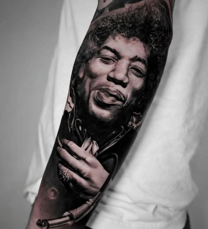
- Is there a "perfect" body placement for a portrait tattoo?
Some good areas for a portrait include the inner forearm, the upper
thigh, the back or even the inner bicep. Any body part which is
large enough to fit the reference and as flat as possible would be
ideal. Areas such as the neck, elbows, or a foot would not be the
opposite, but if I did need to tattoo a portrait in a more difficult
area, I would ensure that the angle and size of the reference
matched the body part, and also that the client’s anatomy was
suitable for the concept we are working on.
Q: Social media is full of high-contrast
'fresh' tattoos that look great under studio lights. How do you
educate your clients on what a realism piece will look like in 5
years, and how does that 'future-look' affect how dark you pack your
initial blacks?
A: I generally trust that my healed work, which I regularly share on
my page speaks for itself. During conversations with my customers, I
often use my own tattoos as a reference of what a certain tone may
look like when healed after a certain number of years, in comparison
to the fresh look that they see on their body. I tend to explain
that the range of values will be clearer when healed, as the
different tones will often lighten by around 30% during the healing
process. In terms of packing my initial blacks, I am quite confident
about what my different tones heal like once they are saturated,
from blacks to light tones. I use a consistent system to create my
grey wash, so I know I can trust my shades and that the healed
result will match the reference.
Q: Do you find yourself inspired more by photography and
movies than by other tattoo artists when it comes to framing your
work?
A: I find inspiration in photography, movies, other tattoo artists’
work and the world around me. Especially in the age of social media,
we are constantly exposed to a wide range of images and references,
including other people’s work. Naturally, when you like somebody’s
work, they automatically become a source of influence. At the end of
the day, all tattooing is influenced by something which has been
done by someone else before. I know I have been influenced by other
artists throughout my career, and I may influence someone who likes
the way I work. As long as each artist is using their own references
to create unique designs, if someone takes inspiration from my work,
I will always see it as a sign or respect and a compliment rather
than an insult.
Q: You’re heading to the Brighton Tattoo
Convention soon. How does the pressure of tattooing in a live,
high-traffic environment compare to the focused solitude of your
home studio?
A: I usually go to conventions to get out of my comfort zone; I also
find them a great way to visit different places, network and learn
from other artists. I am always a bit conscious about wanting to do
my best and showing my best work at conventions - especially to
other artists who I admire. However, I used to feel more pressure
when going to conventions in the past than I do now. Entering my
work into competitions can still be quite nerve wracking, as you’re
directly putting your work out there and getting immediate feedback.
It can also be difficult to manage the time pressure while talking
to potential customers or other artists during the day; I often
wonder if removing the time constraints would make the process more
enjoyable, at least for myself. At the end of the day, my main goal
is to do my best and to focus on creating a piece that my customer
and I are happy with. I understand that the judgement at a
competition is subjective, so I tend not to dwell on it too much.
Q: Do you like the local tattoo scene? Do you see progress?
A: In Bristol, there are a lot of new people getting into tattooing
and they are starting at a much higher level than I was at when I
started, they are years ahead! I do find that there are maybe less
established artists moving into the city in proportion, but I
imagine this to be a similar situation across the world. Most of my
favourite artists are from Europe; when I do go to conventions, I
always see these artists have managed to build strong communities
between them: they travel together, stick together and support each
other, and this is something I think would be great to see more of
in the UK and in Bristol specifically.
Q: Please write down your studio location
and website/social media links. Also let us know if you are
available for bookings.
A: I don’t have a website, but all my work is published on my
Instagram page; @jordanferristattoo I prefer clients to contact me
via email at: jordanferristattoo@hotmail.com
I am available for bookings; the diary is always open for new
projects.
Q: With 'Books Always Open' but a very specific style, what
are the key elements you look for in a client’s request that make
you say, "I have to do this piece"?
A: For me to take on a project, it has got to interest me,
essentially. I would probably prioritise a subject matter that I am
excited about, or an original idea that hasn’t been done a lot
before. I am always happy to be given creative freedom, and these
enquiries usually result in quicker bookings. However, I am willing
to take the client’s lead too; these projects can also be exciting,
even if it may take a little longer to ensure that we’re on the same
page when it comes to the booking. Some of the reasons I may decide
not to take on a project include: a style that is not my area of
expertise, a reference that I don’t think is appropriate, or a
concept that has been done many times before, if I don’t think I can
add anything new to it. It is important to me that a client is
respectful of my time; this can be made clear through our first
interactions, which usually help me gather a lot of information
about how serious a potential client is and whether I’d like to work
with them.
Q: You’ve tackled portraits, statues, and
complex landscapes. Is there a specific subject matter or a new
technique you are currently "obsessed" with perfecting?
A: In the past, my focus was placed on creating hyper-realistic and
very accurate representations of the subject matter. Currently,
while I am still creating highly realistic work, I am also
challenging myself to be playful and have fun. The obsession is not
so much with perfecting a new technique, but more so about being
adventurous and creative with my composition. Nowadays, you will
often see hand drawn details and unusual or unpredictable elements
in my work which will hopefully make my pieces more memorable and
entertaining, again going back to my goal of creating emotion in the
viewer.
Q: You have clients who have been coming
to you for years. How does the creative process change when you’re
working with a 'regular' who has already become a walking canvas for
your evolution?
A: I actually find that the longer I have worked with a customer,
the more restraints they tend to put on the design process. This may
be because they feel more comfortable to put their views forward, or
because, as they start running out of skin, they want to make sure
every element they want is included. Either way, it is always
rewarding to have a customer return and continue to trust you with
their skin over the years. With regular clients, I particularly like
seeing how my healed work ages. I also enjoy having that feedback
and the chance to maintain constant variables (such as a familiar
skin texture) which pushes me along on the pursuit of mastery in
terms of technique.
Q: You’ve spoken about the importance of ethics and ensuring
a client won't regret a piece. In an industry where some just 'say
yes' for the booking, why is it important to you to be selective and
sometimes even act as a voice of caution for your clients?
A: There are a couple of reasons why ethics are important to me.
First, I care about my reputation as an artist: I would not want any
potential clients to see a piece I am not proud of and perhaps lose
confidence in my work. Secondly, tattooing is not just about money
for me; I have always said that if I ever stop enjoying it, I will
find something different to do. I like challenging myself and I take
pride in trying to produce my best work for my customers each time.
This makes giving advice or a word of ‘caution’ a necessary part of
the process. Of course, earlier in my career I would have taken on
projects which may not have been my preference or my style, but they
were great learning opportunities to develop the style and
techniques I use today. Luckily, I can nowadays be more selective
with my work, and the focus has shifted more towards enjoying the
creative process and finding challenging and exciting projects.
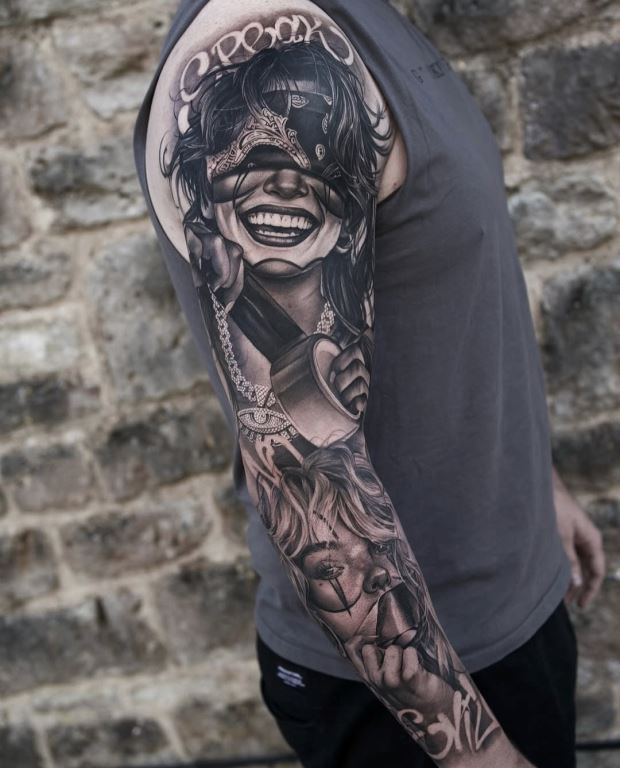
Q: Unlike a painter whose work sits in a
gallery, your 'masterpieces' go out into the world, live lives, and
age with people. How does the 'living' nature of your art affect how
you feel about your career compared to other art forms?
A: This is an interesting question. There is definitely a sense of
responsibility that comes with the fact that your art will be worn
forever. In an art gallery, an exhibition can be displayed and
removed; the artist can stand by its piece and have some control
over where it goes or how it is perceived; if sold, a painting will
always be signed, and the artist remains its clear author or owner.
However, once I create them, my tattoos leave the studio and I no
longer have control over where they go, who sees them, or what
comments or judgement they receive. While I am the one who created
them, they instantly become part of the person who wears them even
more so than they are mine anymore. I think this adds to the
excitement of creating them for me; there is something quite
thrilling about putting a lot of hard work into an art piece and
then letting it go.
Q: Jordan, you’ve dedicated your career to 'The Pursuit of
Mastery.' When you eventually look back on your body of work decades
from now, what do you want the 'Jordan Ferris style' to be
remembered for most?
A: I would like my work to be remembered for its high contrast,
sharp details, consistency and longevity.


