
Interview with Michel Teles
Today, we are joined by Michel Teles, a virtuoso
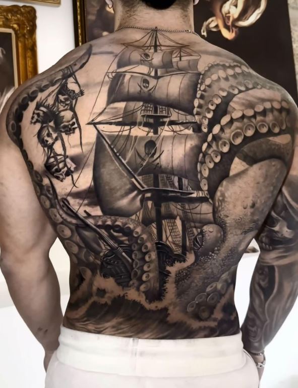
of black and gray realism whose work transcends the traditional
boundaries of skin art. With a portfolio that reads like a gallery
of high-contrast photography, ranging from hauntingly lifelike
portraits to intricate, sprawling compositions - Michel has
established himself as a leading force in the global tattoo
community. As he prepares to bring his signature 'hyper-real'
aesthetic to the United States, we sit down to discuss his journey
from Brazil to the world stage, the technical alchemy of his style,
and his vision for the future of American tattooing.
Q: Every artist has a "spark" moment. Can you take us back
to the very beginning, what was the first tattoo you ever saw or
created that made you realize realism was your calling?
A: It wasn’t a single moment. It was a process. As I studied drawing
and painting, I became obsessed with how close I could get to
realism style. Over time, I realized realism wasn’t just a style, it
was how I see and interpret the world.
Q: How did growing up in Brazil influence your approach to
art?
A: Brazil has a strong tattoo culture, but my biggest influence was
starting from zero in a completely different field. I approached
tattooing with discipline rather than ego. My focus was always on
mastering the craft.
Q: Why did you choose black and gray over color?
A: Black and gray is unforgiving. It’s pure light and shadow,
there’s nothing to hide behind. That challenge attracted me. It also
has a timeless quality that I value.
Q: How did you develop your eye for light and shadow?
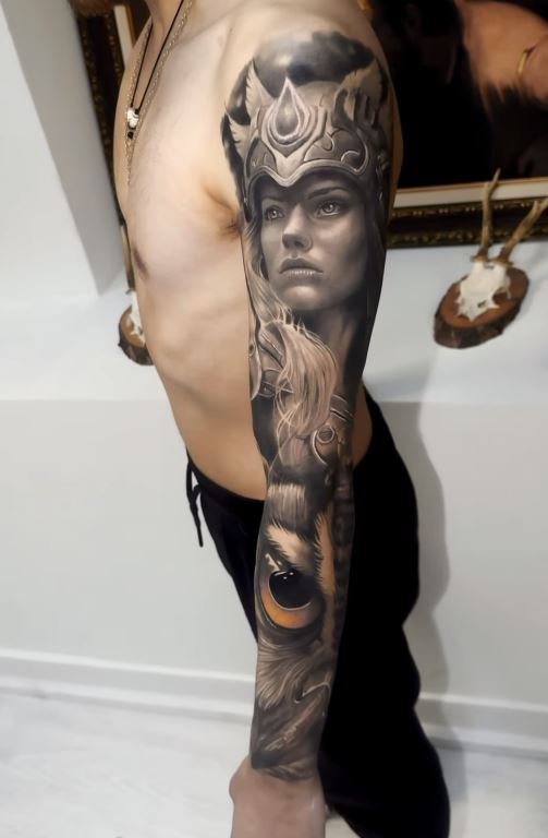
A: Through repetition and analysis. I spent years studying
references, breaking images into values, and understanding contrast.
It’s a trained skill, not something that just happens.
Q: What was your biggest technical challenge early on?
A: Understanding how to translate detail into skin. You can’t copy
everything exactly as in a drawing. Learning what to simplify and
what to emphasize was a turning point.
Q: How do you capture the “soul” of a portrait?
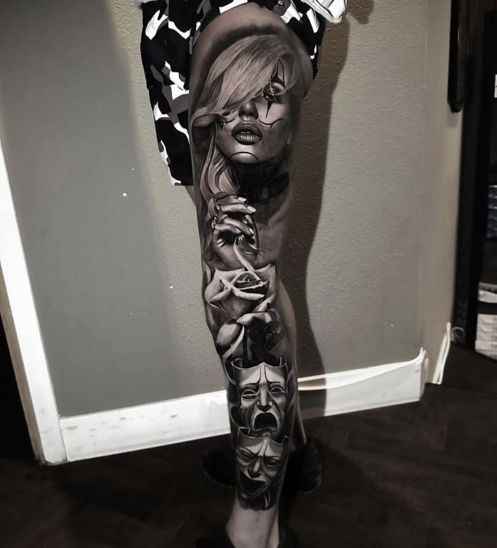
A: It comes from choosing the right reference and focusing on
expression and contrast. It’s not about copying every detail, it’s
about conveying the feeling behind the image.
Q: What techniques are essential to your process?
A: I keep my setup simple. The key is control smooth shading, proper
layering, and consistency. Technique matters, but fundamentals
matter more.
Q: How do you ensure your work ages well?
A: By building strong contrast. Solid blacks, clear mid-tones, and
controlled highlights ensure the tattoo keeps its structure over
time.
Q: How do you approach different textures?
A: By observing how each material behaves. Fur, stone, and skin all
react differently to light. I adjust my approach based on that
understanding.
Q: When do you introduce abstract elements into realism?
A: Only when they add value to the composition. If it doesn’t
enhance the piece, I don’t include it. Everything has to feel
intentional.
Q: How important is digital preparation in your work?
A: It’s a useful tool for planning, especially composition and
lighting. But it doesn’t replace fundamentals. The foundation always
comes first.
Q: Who influenced your use of light?
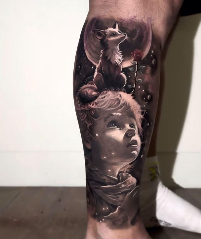
A: Classical painters like Caravaggio and Rembrandt influenced my
understanding of light. In tattooing, I respect many artists, but I
focus on developing my own perspective.
Q: How do you maintain consistency in large-scale work?
A: By thinking about the full composition from the start. Every
element needs to connect and flow as part of a bigger picture.
Q: How do you prepare mentally for high-pressure sessions?
A: By staying focused and trusting my process. Experience helps you
remain calm and consistent under pressure.
Q: How would you describe your style in three words?
A: Precision. Depth. Discipline.
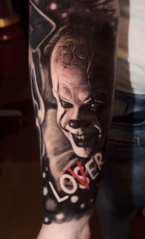
Q: How has being a judge influenced your work?
A: It sharpens your eye. You start noticing details at a different
level, which naturally raises your own standards.
Q: When did you feel you had “arrived” internationally?
A: It wasn’t one moment. It was a gradual process of working in
different countries and building consistency. At some point, your
work speaks for itself anywhere.
Q: How do Brazil and Europe differ artistically?
A: Brazil is more expressive and bold. Europe tends to be more
structured and detail-focused. Both bring something valuable.
Q: Are you open to collaborations?
A: Yes, but they need to make sense. The styles have to complement
each other to create something great together.
Q: Your first “pinch-me” moment in the U.S.?
A: Working with clients who already knew and trusted my work. That’s
when it feels real.
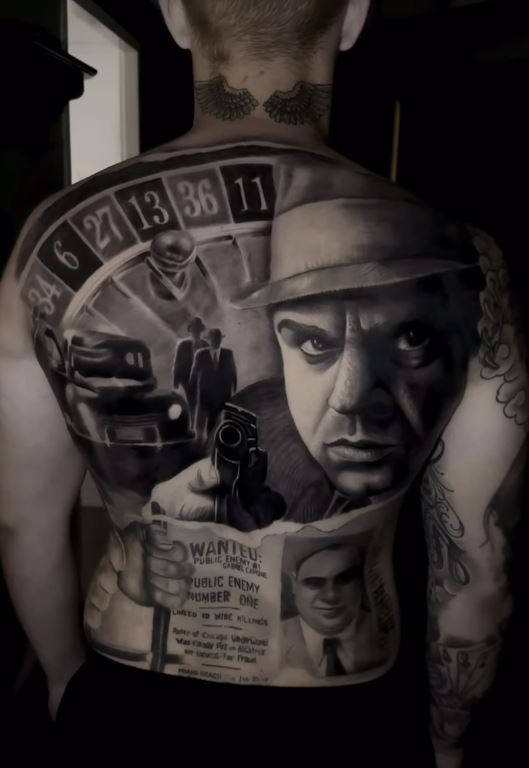
Q: How does the U.S. scene compare to Brazil?
A: The U.S. has a very strong professional structure. Brazil has
more raw creative energy. Both are important in different ways.
Q: How do you build connection with your clients?
A: Through clear communication and trust. The experience is just as
important as the final result.
Q: What defines the Houston realism scene?
A: High technical level, strong contrast, and precision. It’s a
competitive environment that pushes you to improve.
Q: What legacy do you want to leave?
A: Consistency and discipline. A body of work that maintains a high
standard over time.


